
|

|
First week assignment.
4 Assessment Drawings:
The first picture is a "Pair of Shoes with Laces”
The second picture is a "Portrait"
The third picture is a “Street Scene” (Perspective)
The fourth picture is a "Hand"
4 Assessment Drawings:
The first picture is a "Pair of Shoes with Laces”
The second picture is a "Portrait"
The third picture is a “Street Scene” (Perspective)
The fourth picture is a "Hand"
|
|
|
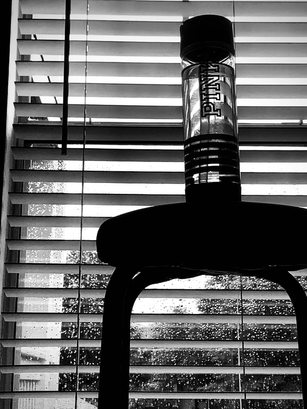
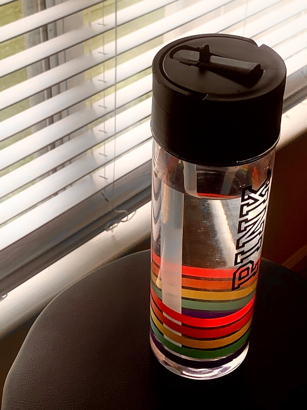
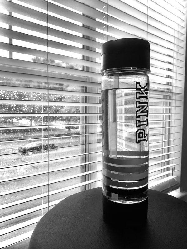
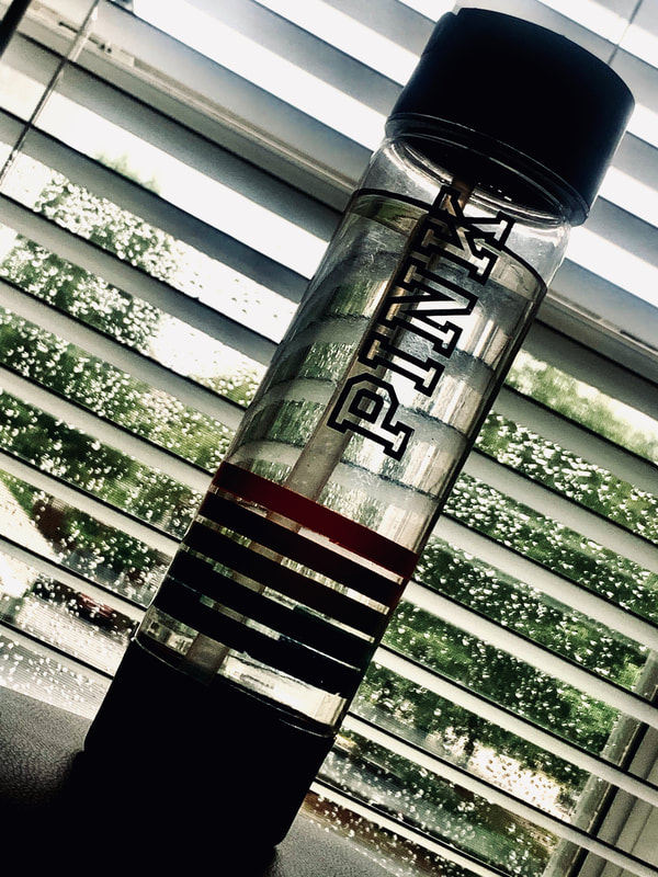
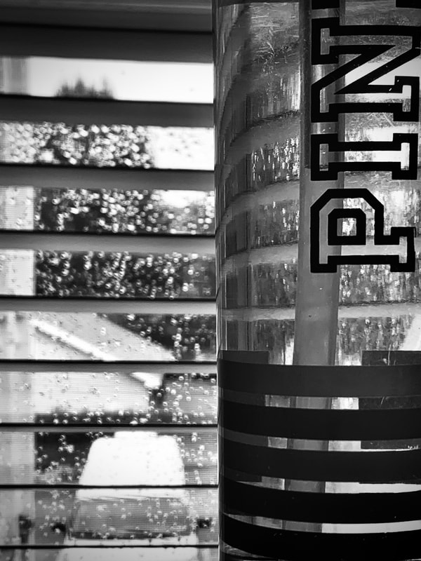
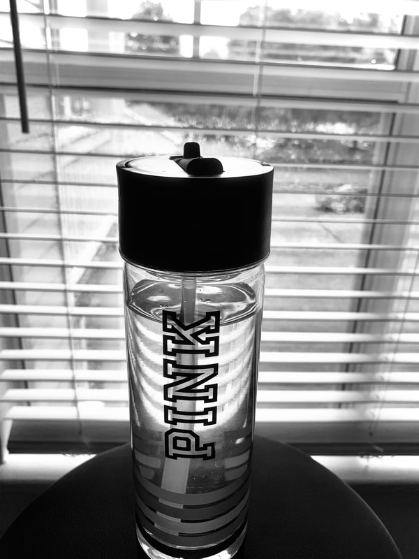
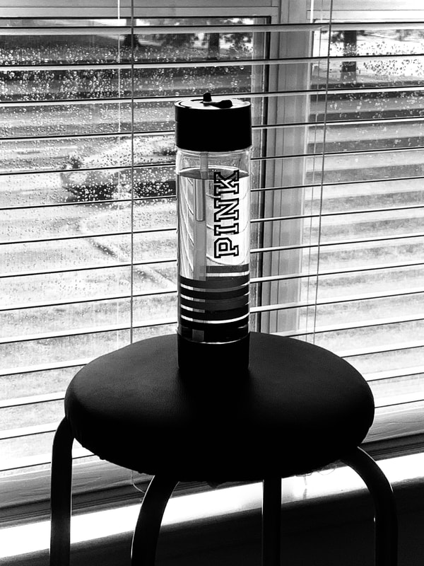
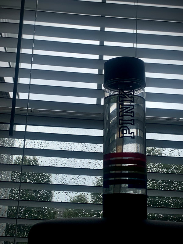
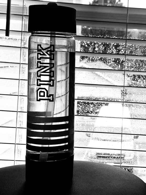
Random Object Photo Composition
9 photos of PINK water bottle from different perspectives and edited to show photo composition.
9 photos of PINK water bottle from different perspectives and edited to show photo composition.
|

|

|
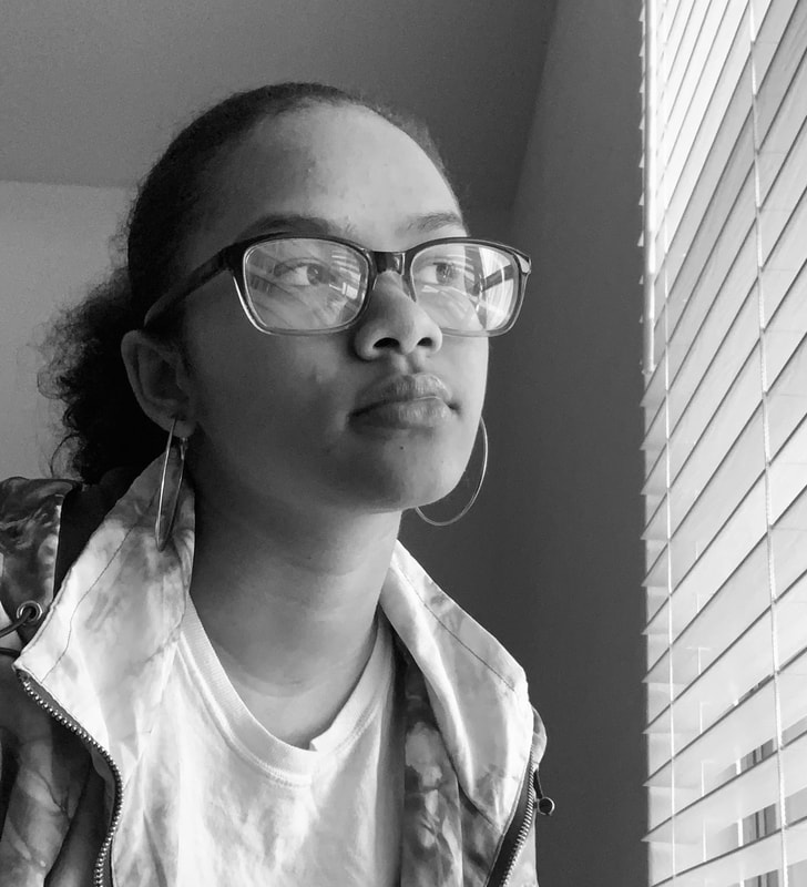
Starting Virtual School Year Story
3 photos explaining the things I do now in virtual school.
The first photo is me looking out the window because I like to see the trees and cars go by.
The second photo is me on the computer for online school because that's all I use for school now.
Finally, the third one is me with my earphones signifying me watching videos and listening to music in all my spare time I had this summer.
Graphite Unit

|

|
Pen/Graphite Day 1
I made four contour line drawings of objects I found around my house. In one continuous line tried to make it look like the object with detail.
The first picture is a Hello Kitty toy
The second picture is a unicorn plushie
The third picture is a perfume
The fourth picture is a Disney cup
I made four contour line drawings of objects I found around my house. In one continuous line tried to make it look like the object with detail.
The first picture is a Hello Kitty toy
The second picture is a unicorn plushie
The third picture is a perfume
The fourth picture is a Disney cup

Pen/Graphite Day 2
I drew 2 objects, one in pencil and one in pen using contour line that is continuous and fluid.
The first picture is a planted succulent
The second picture is a christmas snow globe
I drew 2 objects, one in pencil and one in pen using contour line that is continuous and fluid.
The first picture is a planted succulent
The second picture is a christmas snow globe
Pen/Graphite Day 3
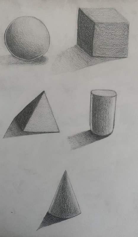
5 Shaded Basic Forms
Form 1 is a sphere.
Form 2 is a cube.
Form 3 is a pyramid.
Form 4 is a cylinder.
Form 5 is a cone.
5 Shaded Basic Forms
Form 1 is a sphere.
Form 2 is a cube.
Form 3 is a pyramid.
Form 4 is a cylinder.
Form 5 is a cone.

Pen/Graphite Day 4
Unseen Things Compositional Sketches
The first sketch is a panel that's hidden behind my door.
The second sketch is an outlet behind our dining room bench.
The third one is the remote control cars i have at the top of my closet.
Unseen Things Compositional Sketches
The first sketch is a panel that's hidden behind my door.
The second sketch is an outlet behind our dining room bench.
The third one is the remote control cars i have at the top of my closet.

|

|
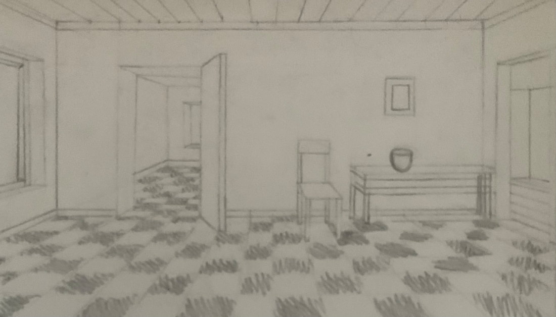
Unseen Things In Progress #1 and #2
The first image is the sketch before I started to add shading.
The second one is the 3/4 of the way done I just needed to finish the floor and add finishing touches.
The first image is the sketch before I started to add shading.
The second one is the 3/4 of the way done I just needed to finish the floor and add finishing touches.

Unseen Things Final Drawing
This drawing is of a power outlet that is behind a bench in my dining room
and the shadow from the bench gave it an interesting look.
This drawing is of a power outlet that is behind a bench in my dining room
and the shadow from the bench gave it an interesting look.
Critique Questions
1. Explain the process you went through to develop your drawing (sketches, planning, in progress, etc).
Firstly, I took the critique I got about the placement of the outlet in the photo and I put it at an angle. I did this because the angle showed more of the shadows and gave more shapes. Secondly, I sketched with a ruler and some pencils to I could make sure to get the angles right. Then, I started with the shadows of the bench adding layers of graphite and blending with the tortillons to make them smooth. After the shadows, I did the shelf and outlet then the floor.
2. How important is composition to the success of your drawing?
As far as composition I try to use the rule of thirds. I kept the outlet on the points of the left side so I wasn’t in the middle and would make the picture more engaging. The composition I chose also really effected the out overall image before it was straight on and now its angled and shows more the shows.
3. Explain how you found the different values in your object?
The different values came from the shadows and how much light was on the bench. The top of the bench shadows is lighter because its exposed to more light. The shelf also has light shadows because it’s not being covered by the bench all the way.
4. Did you achieve a full range of the different values within your drawing? How?
I achieved values by doing the darker shade first because it is mostly seen in the photo. From there in the light spots, I blended the value out with the tortillon. Also, for the lighter shades on the self, I used whatever graphite was left on the tortillon to make sure the shade stated even.
5. Describe your craftsmanship. Is the artwork executed and crafted neatly?
Yes, my artwork is neatly executed and crafted neatly. Before even starting to shade I drew an outline with the ruler to make everything look straight and angled. I then shaded and followed the outline making it look neat and thought out and added additional touches to give detail.
6. How important was learning the skills and techniques prior to the final drawing?
It was very important to learn the skills and techniques. They helped me with practicing and getting familiar with blending again as well as observation. I also got to learn better about the pressure of my pencil and the effect it would have on my piece.
7. How did you grow as an artist?
As an artist, I learned how to draw at angles better. As well as keeping one consistent and even shade throughout the piece. Also, I got better at doing multiple shades with the same pencil and blending them to make gradients.
8. List any obstacles you had to overcome and how you dealt with them.
One of the toughest obstacles was the shelf at the top of the picture. Trying to draw it at an angle was hard but when it came time to shade and make it look like the image that was almost impossible. Another thing is the size of my paper. I felt that it was really hard to draw the image freehand on a big piece of paper. If I could have I would have done a grid first but I wanted to show my freehand skills.
Pen and Ink

Pen Techniques
I chose to do my polaroid camera and used stippling to show the shadows and make it 3D.
I chose to do my polaroid camera and used stippling to show the shadows and make it 3D.

Pen and Ink Value Chart Worksheet
I used different pen techniques to show gradients.
I used different pen techniques to show gradients.

Pen and Ink Form Worksheet
I used the stippling technique to make forms 3D.
I used the stippling technique to make forms 3D.


Pen and Ink Drawing Videos
I used pen technique videos to show different textures on 3D objects.
I used pen technique videos to show different textures on 3D objects.
Perspective Unit

|
|
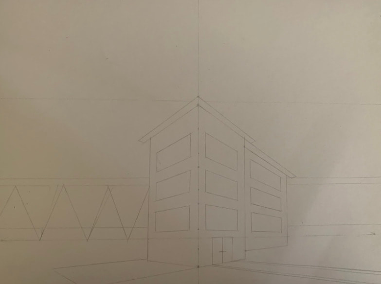
1 Point Perspective Videos
I made these drawings following the 1 point perspective videos.
I made these drawings following the 1 point perspective videos.

|
|
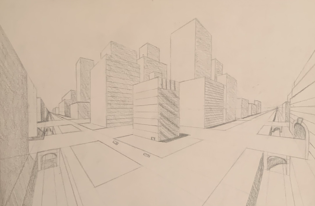
2 Point Perspective Videos
I made these drawings following the 2 point perspective videos.
I made these drawings following the 2 point perspective videos.

|
|
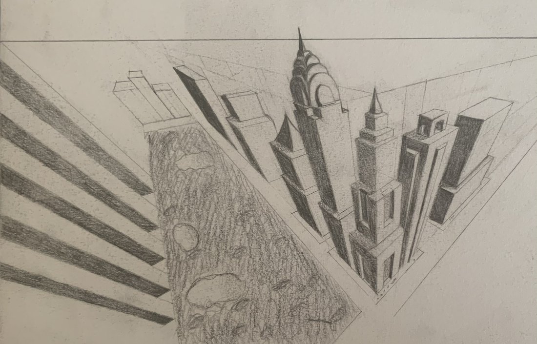
3 Point Perspective Videos
I made these drawings following the 3 point perspective videos.
I made these drawings following the 3 point perspective videos.

Forced Perspective
I made the water bottle look like it was leaning and that I was pushing it back up.
I made the water bottle look like it was leaning and that I was pushing it back up.
Pen Perspective Project
Brainstorm Ideas
1. Lady and the Tramp- A real lady and a tramp.
2. Wicked queen and her castle from Snow white
3. Golden Goose
4. Aladdin and the magic lamp
5. Rumpelstiltskin
6. Cinderella(looking up at the castle)
7. Beauty and the Beast(looking up at the castle with the beast in the window)
8. Sleeping beauty(dreamland)
9. Hansel and Gretel(and the house)
10.Bluebeard
11. Matilda and the books flying(in perspective)
12. Little red riding hood looking up at the wolf
13. BFG(Big Friendly Giant) silhouette in the distance, city in the foreground)
14. Fox and the Hound
15. 3 little pigs (Houses in perspective)
16. Peter pan and captain hooks ship sailing the sky
17. Jack and the beanstalk (Birds eye)
18. Goldilocks and the 3 bears (porridge on the table)
19. Pied the Piper
20. Elves and the shoemaker
Sketches


In-Progress
|

|

|
Final Drawing

Colored Pencils/Watercolor


|


|
Colored Pencil Forms
I used colored pencil to show value on 2 different forms which were a sphere and a cone.
I used colored pencil to show value on 2 different forms which were a sphere and a cone.

Colored Pencil Fruit
I chose a strawberry to show a range of values with colored pencils. I Included a light source, cast shadow and a surface.
I chose a strawberry to show a range of values with colored pencils. I Included a light source, cast shadow and a surface.

Watercolor Techniques
I used watercolor to demonstrate different techniques.
I used watercolor to demonstrate different techniques.

Watercolor Value Scale and Form Shading
I used watercolor to show a value scale in 3 different colors as well as 3 forms which was a cone, a sphere, and a cylinder.
I used watercolor to show a value scale in 3 different colors as well as 3 forms which was a cone, a sphere, and a cylinder.

Watercolor Practice Peppers
I chose the peppers as reference and tried to match the exact proportions and colors.
I chose the peppers as reference and tried to match the exact proportions and colors.
Brainstorm Ideas
1. Close up of kiwi
2. Close up of dandelion
3. Close up of leaf
4. Close up of under a mushroom
5. Close up of birch wood
6. Close up of peacock feather
7. Close up of sea shell
8. Close up of crimson speckled moth
9. Close up of pineapple
10. Close up of fern
11. Close up of a brush viper
12. Close up of a blue sea slug (glaucus atlanticus)
13. Close up of porcupine quills
14. Close up of emperor angelfish
15. Close up of Oriental Kingfisher
References

Close up of a brush viper
|

Close up of a blue sea slug (glaucus atlanticus)
|

Final sketch
In-Progress


|


|
Final Painting

Reflection Questions
1. What watercolor/colored pencil techniques proved to be effective in your painting/drawing? How and Why? One technique I used was a flat wash so that I could get my base colors down to layer and darken the colors. Some of the scales had gradients in them so I made sure the colors were smooth and blended well. I also used stippling in one of the scales to get the dotty effect that was in my reference image.
2. How important was using transparent layers (just layers for colored pencils) in your painting/drawing? Transparent layers, in the beginning, was important for me because I needed to layer my colors to get them to match the reference. They also helped me when it came to gradients and fixing mistakes I made.
3. Explain how your composition was successful? Did you utilize all the elements of art and principles of design? Explain. My composition was successful because the crop of my image made the different colors of the scales contrast. As well as the space in the upper right which helped to contrast the image and help the viewer see the shadows and array of colors.
4. Was color choice an important factor in the overall success of the painting/drawing? Why? The color choice was important in the success of my painting because if the colors didn’t match the last layer I put then it would’ve changed the whole color of that section. The gradients I did also depended on color choice for them to match the reference and look blended.
5. How did you use your knowledge of Georgia O’Keeffe as inspiration for this piece? Georgia O’Keeffe inspired the composition of my painting by making me focus on the flow of the colors as well as the different patterns and textures.
6. Describe your craftsmanship. My craftsmanship is neat and shows a good amount of effort. There was thought and care put into the piece and the final product is very vibrant and pleasing to the eye.
7. If you were an art critic how would you judge your work? I would point out areas that could’ve been cleaner as well as the evenness in some of the colors that could’ve been improved. Overall I would appreciate the deepness of the colors as well as the contrast and variety of colors.
8. If you were able to do something different what would it be and why? I would’ve been more patient when it came to letting layers dry and/or using less water when putting down color.
9. Explain to me what you have learned about watercolor/colored pencil and how it has improved or discouraged your development in art. I’ve learned that watercolor is more challenging than acrylic and how it has discouraged me from using it as a medium in the future. Colored pencils, I learned, is for people who want to take it seriously and have the patience and imagination needed to complete a piece. Both have taught me patience and have given me a better understanding of the artist that use those mediums.
Collage Unit
Brainstorm Ideas
1. Taj Mahal, India
2. Easter Island, Chile
3. Great Wall, China
4. Chichen Itza, Mexico
5. Yellowstone National Park
6. Bagan, Myanmar
7.Grand Canyon
8. Dolomites, Italy
9. Canadian Rocky Mountain Parks
10. Tongariro National Park, New Zealand
11. Wulingyuan, China
12. China Danxia, China
13. Mostar, Bosnia & Herzegovina
14. Dorset and East Devon Coast, UK
15. Benagil Sea Cave, Portugal
Sketches and References


|


|

|

|
Final Color Sketch
In-Progress


|


|
Final Collage

Reflection Questions
1. Describe why you chose your subject matter and what makes the composition interesting?
I chose my subject because of the many colors it had and the number of values it showed. As well as the composition of the image having the main focus, the archway, off to the side. The composition is in a curve with the left being the start and it transitioning to the right.
2. Describe the accuracy of your proportion, values, and shading.
My piece is accurate to my reference because I focused on the proportions, values, and shading of the reference and kept it simple with the details. The archway and hills have accurate proportions and the values of the sea, sky, and grass are accurate.
3. How did you use texture to add visual interest?
Most of the texture for the archway came from the rock-like textures in the magazines as well as the hills and grass. But regarding the sea, I used different shades of blues to get the look of values in the water.
4. How did you decide what shapes and textures to use for your collage?
For the textures, I mostly looked for the correct colors, and if I found something with texture that was accurate to the reference I would use it. For the shapes, I sketched the outline simply and I tried to use a variety of magazine shapes so they don’t look the same.
5. Do you feel that you used a full range of values to reproduce your photo in the collage format? How have you attempted to create depth using foreground, middle ground, and background?
Yes, I used a full range of values from the grass, to the sky, to the sea. The depth was created by the hills and the sky in my collage and the values of colors I used the make the foreground, middle ground, and background.
6. Describe your craftsmanship. Is the artwork executed and neatly crafted?
My craftsmanship in my artwork is executed neatly because you can tell the difference between the foreground, middle ground, and background as wells as what the shapes are supposed to be.
7. Describe how you might improve your artwork if you were to redo the project?
I don’t see anything I want to improve upon but if could redo the project I would choose something easier to do.
